Creating a Forms System for the City of Austin
Research, Service Design, UX Design
Overview
Forms connect residents to government services. This means challenging, unusable, or inaccessible forms block residents from accessing those services. Unfortunately, the City of Austin has many such forms - paper based, overly complex and difficult to understand, and incompatible with assistive technologies.
Opportunities
Create and demonstrate a new process for designing accessible and effective City forms, using one of the most accessed forms on the website as the pilot, the Animal Foster Form.
The Austin Animal Center is a high-demand animal shelter that constantly needs volunteers. About 1,100 people make it through the application process a year, but only around 18% become foster volunteers. We sought to improve these numbers by improving the first major touchpoint for applicants, the foster form.
Outcomes
A responsive, accessible form that supports the end-to-end service of fostering an animal.
A Digital Forms Guide that staff across City departments now use in redesigning their departments’ forms, a forms best practices community, and procurement of a more effective platform for creating forms.
Impact
This particular design organization was disbanded before the foster form was developed, so we can’t measure long term impact. Early indicators were promising -
In usability testing, we saw an increase in completion and comprehension rates.
In our follow up survey, the overall sentiment score increased to 4.6 out of 5, rising in each category.
The confidence score increased from an average rating of 3.6 to 4.6 out of 5.
I incorporated our best practices and guidelines into the City of Austin's Digital Forms Guide.
The forms guide is currently in use by employees across 51 departments and is being actively maintained and updated. Almost everyone who creates a form in the organization is provided the guide to use.
I collaborated in the creation of a forms best practices community, bringing together UX and IT practitioners from across the organization.
This group later led an initiative to procure a better form builder platform as the standard for the City. This platform, Formstack, makes it easier for City staff to create digital, accessible forms that integrate into their workflows and can handle the range of complexity required.
Team
My role Project lead, research, content strategy, UX design, and client relationship manager.
Collaborators Product manager, content strategist and copywriter, a UX designer who owned the process page, research assistants, developer, clients, and a representative from the IT department whom I was mentoring in human-centered design.
Case Study
Identifying Opportunities: Baseline Usability Testing and Service Mapping
A remote usability test session where the participant struggled with the form’s error handling
We did baseline testing of the existing form to understand the current experience and identify areas of improvement. One major finding was that participants had very different expectations of the fostering process which we hypothesized led to drop off.
Sample Insights
In the baseline metrics survey, the form rated pretty well - 4.2 average positive sentiment across our questions. Here’s where it got interesting: one of the questions had a significantly lower rating than the rest - how confident they understood what will happen next, which dropped to 3.6. We asked what they expected the process to be and found it was quite different from reality.
Additionally, though participants rated high confidence that they understood what they were being asked, we observed that they were struggling to understand and answering some questions incorrectly. Overall there was a significant difference between perception and reality.
The form seemed quite long compared to typical forms best practices and we hypothesized that participants would become frustrated, fatigued, or give up. We were surprised to find that participants didn’t find it too long at all. They felt the length and number of questions were appropriate considering the responsibility they would be taking on. The length helped them feel the animal center was adequately considering and vetting applicants and provided helpful considerations.
I created a service blueprint to understand the end-to-end fostering process and how the form fit in. Using this information, I redesigned form content to inform users of the process and prepare them for what to expect.
Identifying More Intuitive Language Through a Market Audit
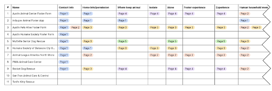
I audited the foster forms of the other animal shelters in the area, as well as similar shelters from around the country. One thing I looked at was which question topics they include in their forms and how they organize their topics. I initially expected our client’s form to have more extensive content than most but found it to fall in the middle, with some of the more popular organizations actually including more content than ours. This supported our research insight that in this context, more content can lead to more success than stripping down to the bare minimum.
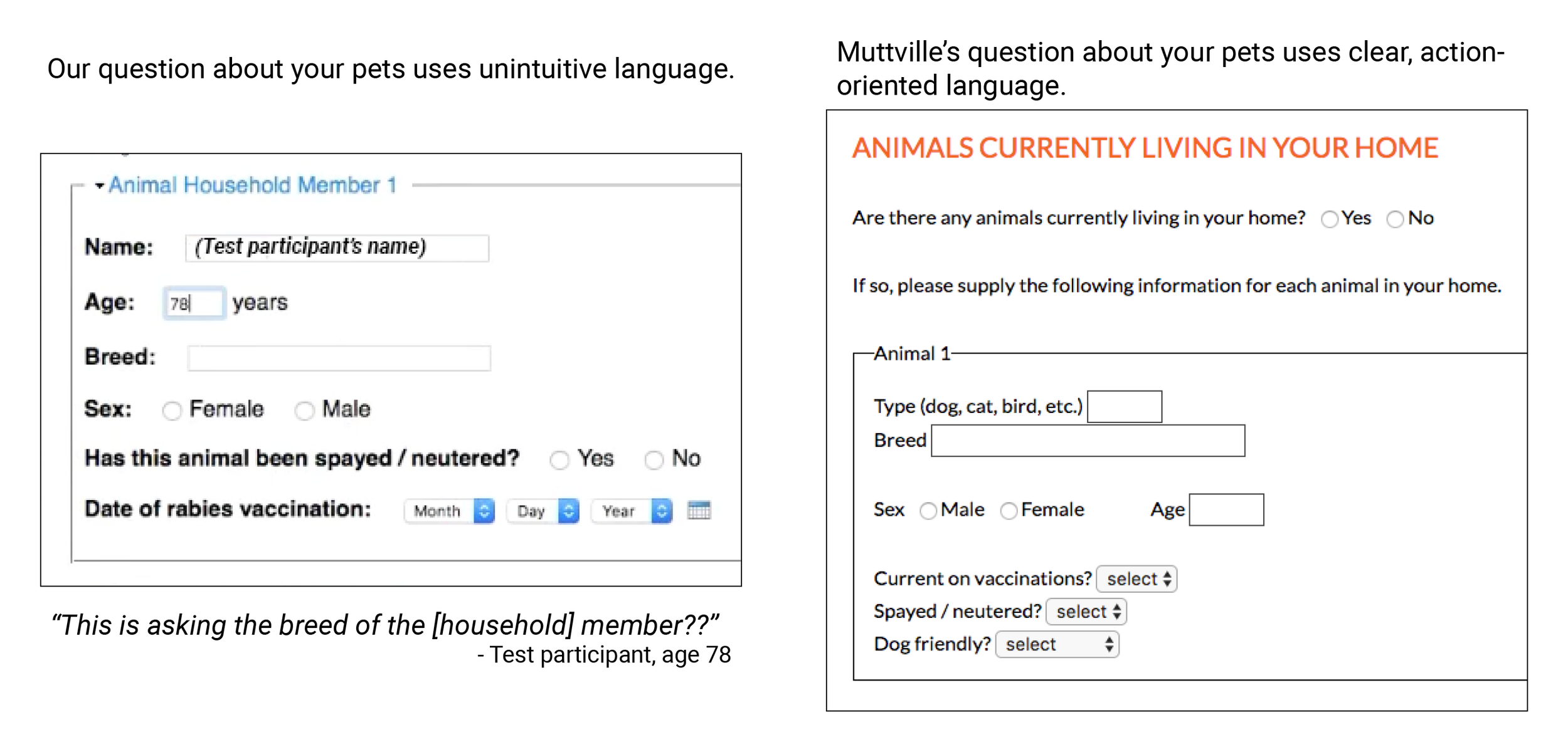
A sample comparison of our form to another in the market
We also observed that friendlier, warmer language could improve conversion rates because, while longer, the warmer tone helps with recruiting volunteers. Additionally, as someone unfamiliar with the animal fostering world, I was able to gather and compare different ways of explaining the same information, identifying more intuitive language and generating helpful ways to expand on content that test participants misunderstood.
Handling Extensive Content Through Content-First Design and Information Architecture
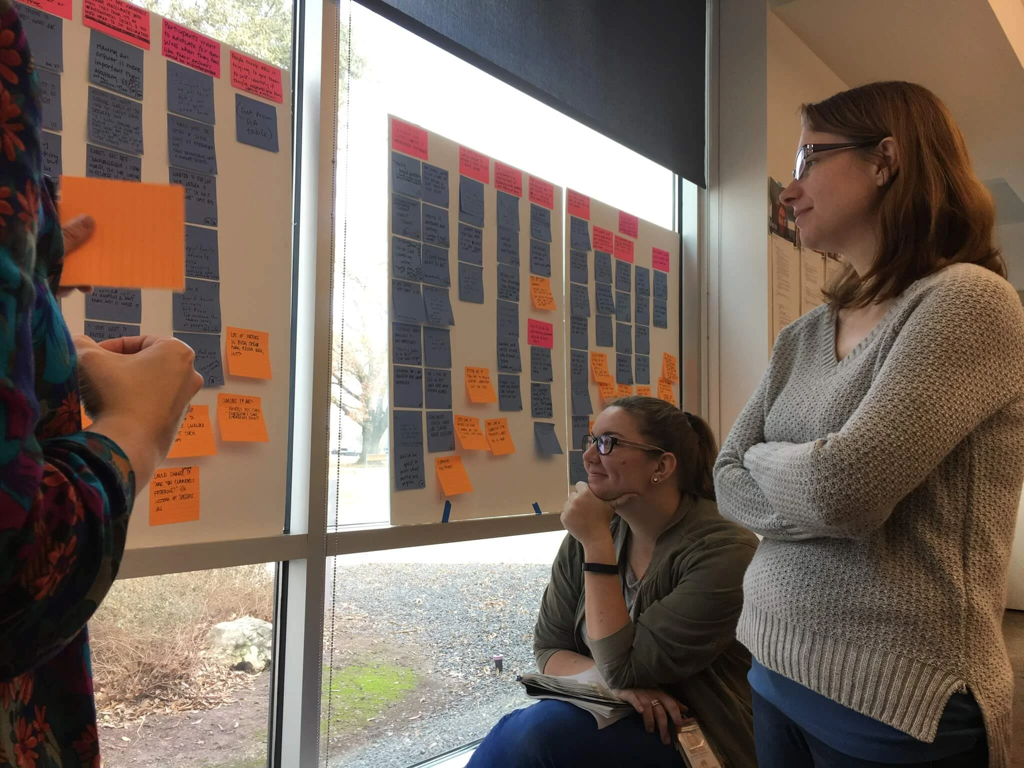
Using the service blueprint, market audit, and co-creation sessions with animal center staff, my content strategist and copywriting colleague Court and I defined our content. We built on the existing content by informing users of the process, preparing them for what to expect, and incorporating a friendlier, warmer tone. We hypothesized that the additional content would benefit and be received well by users based on the baseline testing. However, we also had an ample amount of content in our hands that would overwhelm if not organized well and selectively displayed. We went through an iterative process of removing all unnecessary content while adding what was missing. Then, based on different user types, we identified which content should be displayed to everyone and which content would be better disclosed in select circumstances. Following this we explored various information architecture arrangements until we settled on one that we hypothesized would flow most logically for users.
Supporting Selective, Customized Information Display
Sketch exploration of form components
Conditional logic examples from prototype
Throughout the project, I utilized paper sketching, digital wireframing, and html/css prototyping. One of the primary design challenges was how to share enough information for each user type without sharing more than they need. Using progressive disclosure and conditional logic, I manipulated which questions users would see for different scenarios and user-controlled expanding and collapsing information sections for those who wanted to learn more. I created a color coded system of alerts that displayed when certain answers were chosen. With the assistance of my development collaborator Mateo, I created a form prototype using Bootstrap, html, and css that I continually modified throughout the design process. I created something functionally close to my designs, then Mateo added the javascript capabilities to make it interactive. As a result I was able to get more authentic reactions from participants during usability testing, which was important because we were unsure if the interactions would be accessible for low digital literacy and screen reader users. These interactions tested well!
Designing and Testing to Support Inclusivity and Accessibility
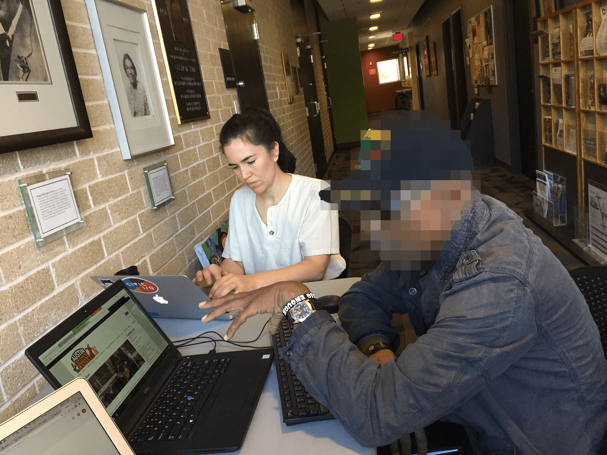
We recruited participants at the public libraries.
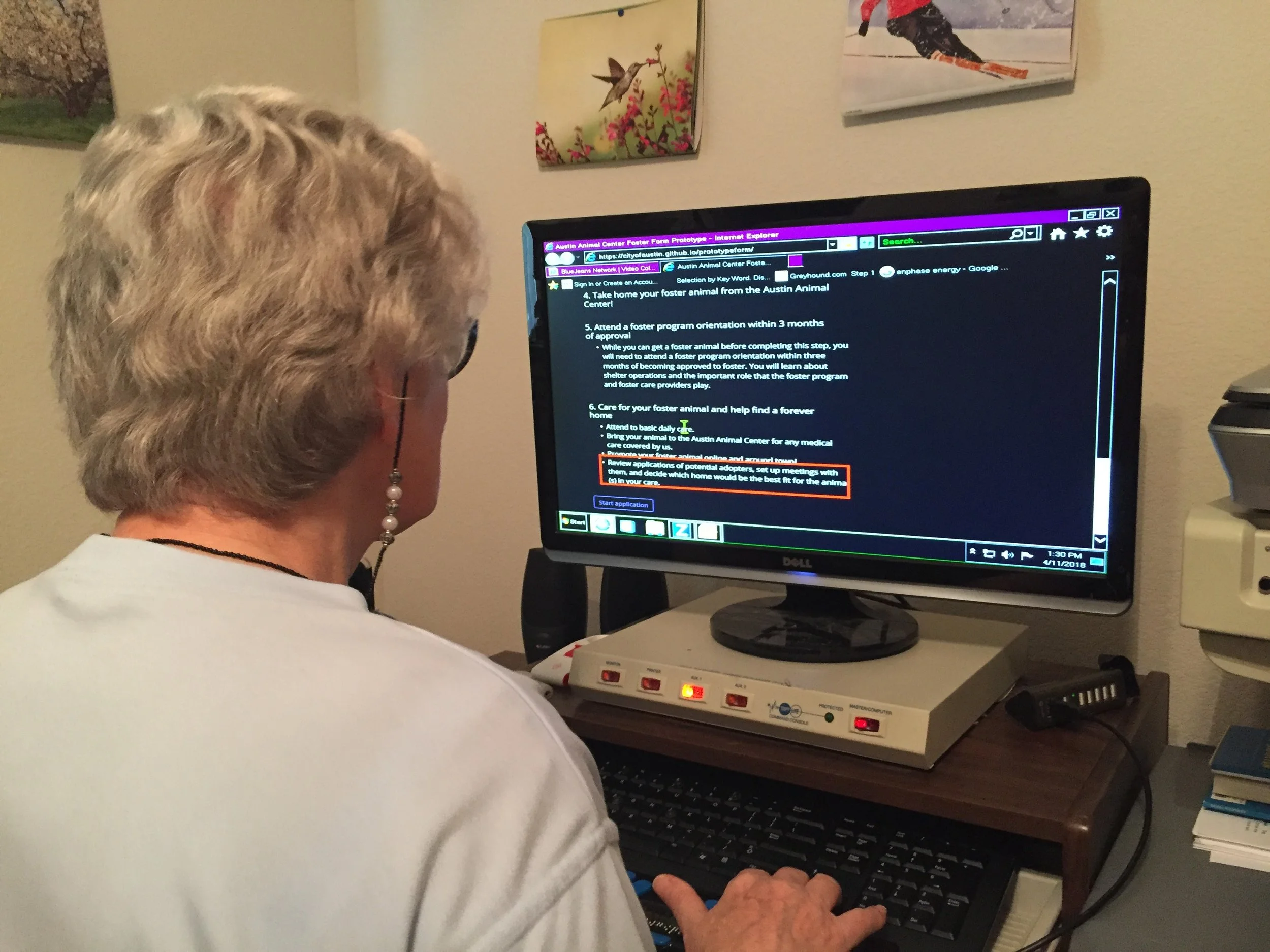
Observing a screen reader user.
I accounted for accessibility from the beginning by following ADA best practices, evaluating prototypes with a web accessibility tool, and writing at a 5th-grade reading level.
In testing, I wanted to reach participants that represent the diverse residents of Austin - ethnicities, digital literacy levels, ages, socioeconomic groups, and accessibility needs. To reach those harder-to-recruit participants, we tested at libraries that serve these populations. We also utilized a contact at a disability advocacy nonprofit to connect us to users with visual impairments.
Had we not done this outreach, we would not have identified specific blockers that got screen reader users and users with lower digital literacy stuck in loops.
Collaborating with Clients and Incorporating Their Needs
It is typical of internal users to fear change; with strained resources, the wrong changes could make a precariously balanced workload topple into chaos, and they get abandoned with the consequences. The Animal Center staff were initially skeptical about a redesign because they were used to their form; it was a known quantity. I brought them along in the process, made them feel heard, and incorporated their needs while also doing what was best for the public users. In the end, they enthusiastically approved the new application.
Impact
This particular design organization was disbanded before the foster form was developed, so we can’t measure long term impact. Early indicators were promising -
In usability testing, we saw an increase in completion and comprehension rates.
In our follow up survey, the overall sentiment score increased to 4.6 out of 5, rising in each category.
The confidence score increased from an average rating of 3.6 to 4.6.
I incorporated our best practices and guidelines into the City of Austin's Digital Forms Guide.
The forms guide is currently in use by employees across 51 departments and is being actively maintained and updated. Almost everyone who creates a form in the organization is provided the guide to use.
I collaborated in the creation of a forms best practices community, bringing together UX and IT practitioners from across the organization.
This group later led an initiative to procure a better form builder platform as the standard for the City. This platform, Formstack, makes it easier for City staff to create digital, accessible forms that integrate into their workflows and can handle the range of complexity required.

